Case study
Brand identity, print and website design for an independent private chef and catering business in Yorkshire and the North East.
Branding / Graphic Design / Print / Web Design
Client
Oyster & Olive, led by chef Kevin Hacking
Sector
Private chef & bespoke catering
My role
Logo & brand identity, business cards, website design & development
Vehicle livery
Produced and installed by another company, using my logo
Website
oysterandolive.co.uk
Project overview
Oyster & Olive is an independent private chef and catering business led by chef Kevin Hacking. Kevin cooks for dinner parties, holiday homes, weddings, celebrations and corporate events across Yorkshire and the North East.
My work with Oyster & Olive began with the logo and brand identity. From there it grew into business cards and the company website. I’ve worked with Kevin for several years now, and the relationship has continued as the business has grown, with each new piece built on the same visual foundations.
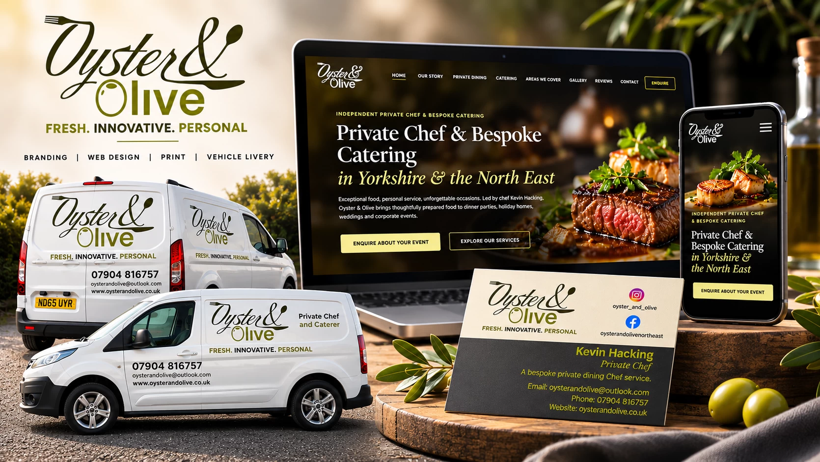
Because the same identity runs through everything, the brand stays consistent wherever people meet it: on a business card handed over after a dinner, on the website when they’re ready to enquire, or on the company van, where the vehicle livery was produced and installed by another company using my logo.
Brand identity
The logo pairs a flowing script wordmark with a clean, rounded sans serif. Cutlery is drawn into the lettering itself: a fork leads into the opening stroke of Oyster, and spoon shapes finish the ampersand and the long sweep that underlines the name. The O of Olive doubles as an olive, complete with its highlight.
A deep olive brown and a brighter olive green give the identity a natural, food-led palette taken straight from the name, and the strapline Fresh. Innovative. Personal. sums up Kevin’s approach in three words.
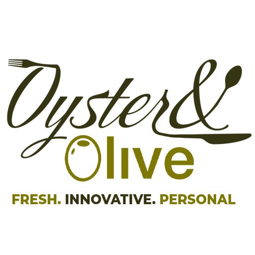
Olive brown and olive green, used for the logo, the strapline and supporting text on every piece.
Expressive script for personality, balanced by a sturdy sans serif that stays legible at any size.
The same logo, colours and strapline carry across the business cards, van livery and website, so the brand is instantly recognisable.
Print & brand in use
Taking the identity into print meant thinking about how it would be seen up close, on a card that’s handed over and kept. The same logo now also appears at a much larger scale on the company van.
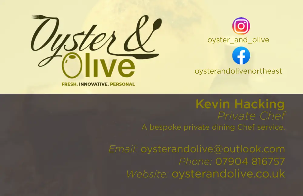
The business card is a single-sided design. The logo and strapline sit on a soft cream panel alongside the Instagram and Facebook handles, while Kevin’s name, role and contact details are set in olive tones over a darker, food-photography background.
Splitting the card in two keeps the brand and the contact information clearly separated, so the essentials can be read at a glance. The artwork was prepared print-ready, with bleed and trim, for professional printing.
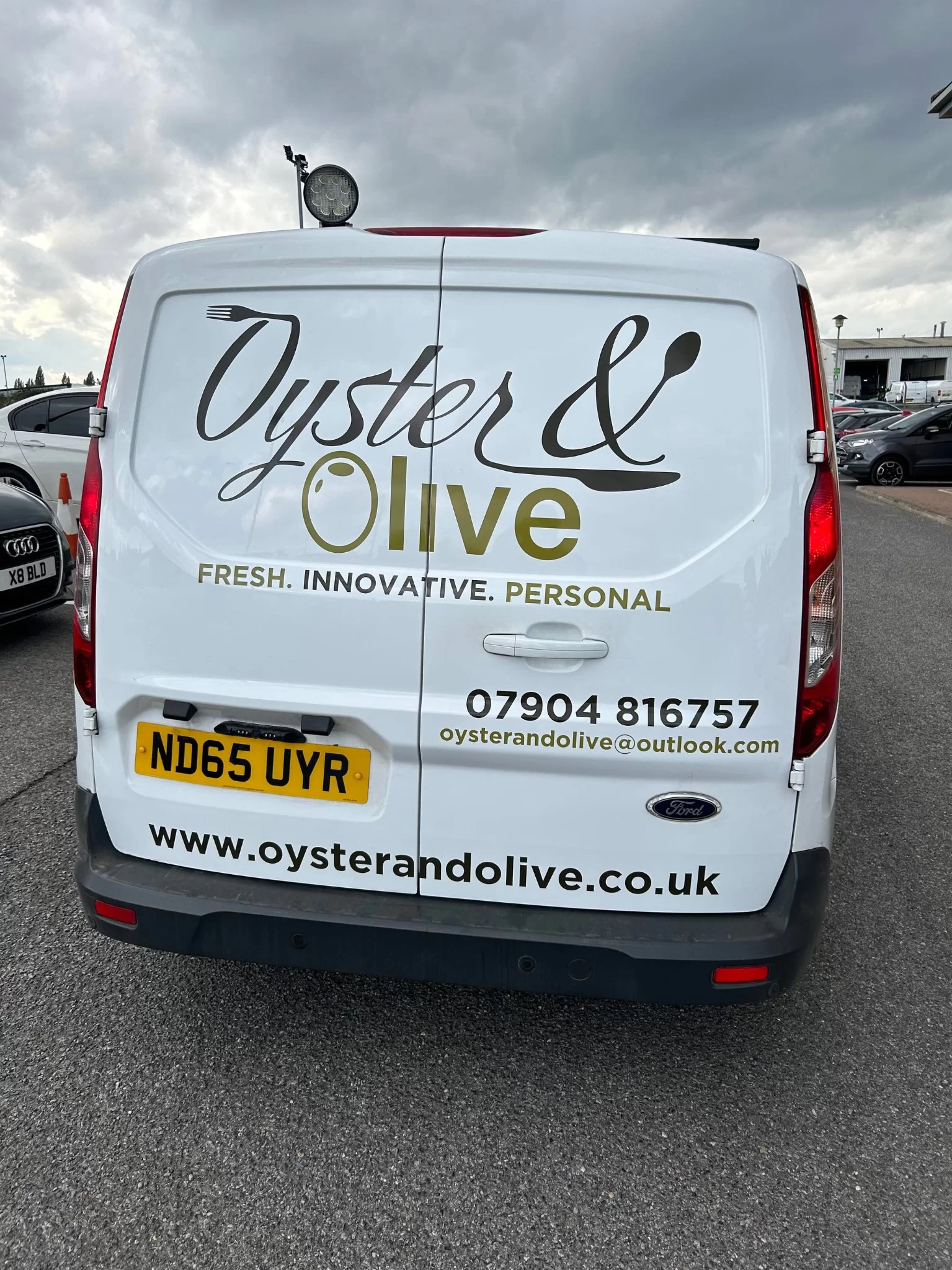
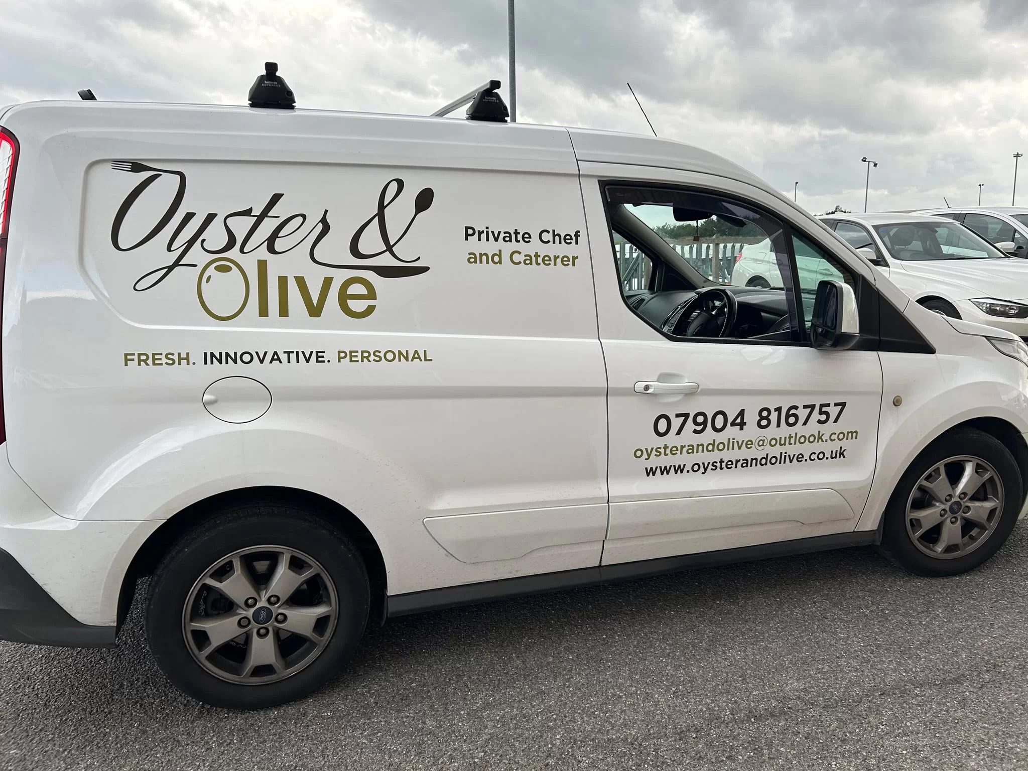
The van livery was produced and installed by another company, using the logo I designed. It’s included here to show the identity in use: the script wordmark, olive and strapline remain clear and recognisable when applied at a much larger scale.
Website design & development
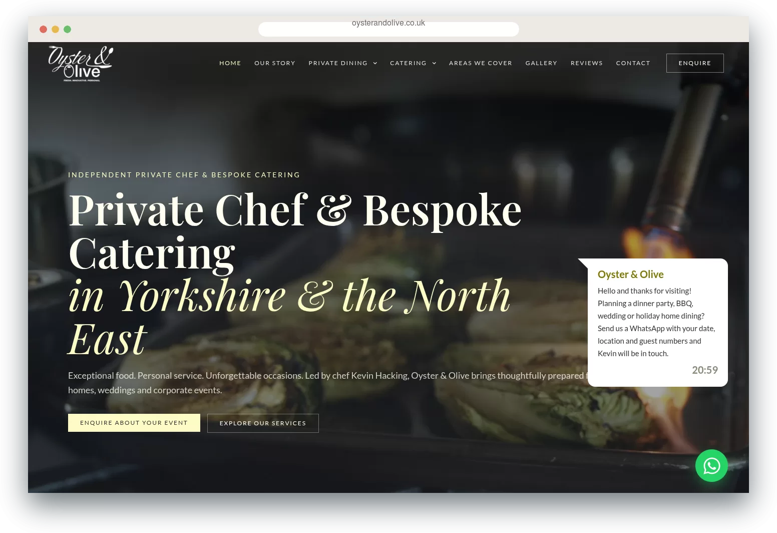
The current Oyster & Olive website is a complete redesign: a dark, atmospheric look that lets the food photography lead, with refined serif headings, a warm accent colour and a clear route to enquire from every page.
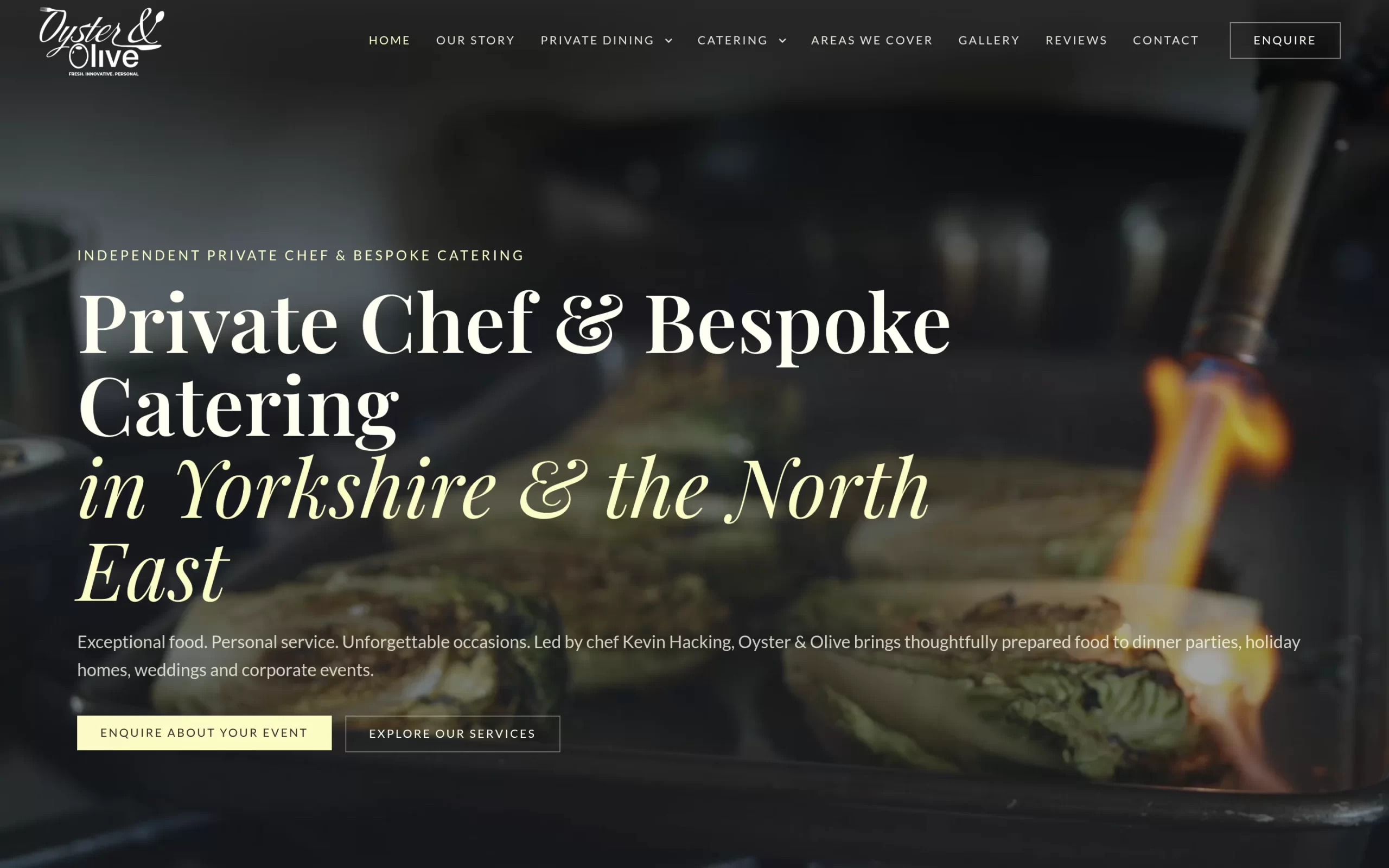
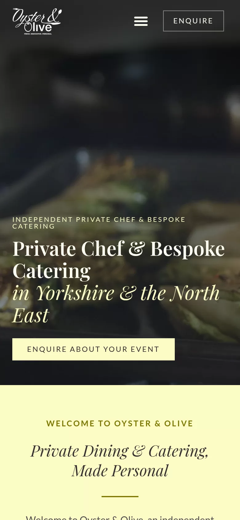
The navigation is organised around how people book: private dining, holiday home dining, cooking experiences, catering, BBQ catering, weddings & occasions and corporate hospitality, alongside Kevin’s story, the areas covered, a gallery, reviews and contact.
Each page leads to a clear next step. An Enquire button stays in the header, calls to action are repeated through the content, and genuine Google reviews help visitors feel confident before they get in touch.
Every service has its own dedicated page, and location pages for Darlington, Durham, Harrogate, York, Ripon and Richmond describe the service in the places Kevin works, with descriptive page titles and clear headings throughout.
Responsive design
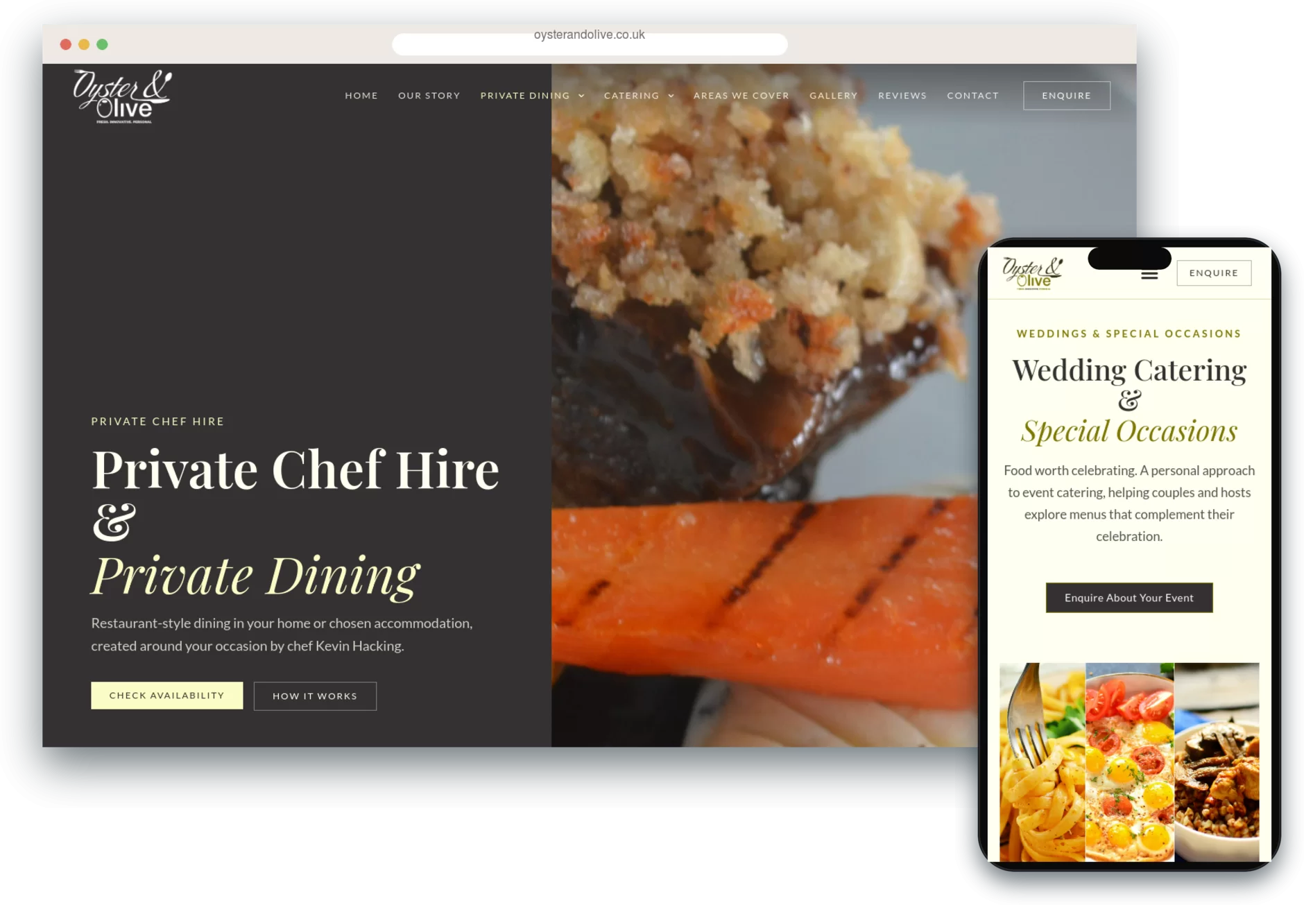
Many enquiries start on a phone, so every layout was designed to adapt for tablet and mobile. Navigation collapses into a compact menu, headings and imagery rescale, and the enquiry buttons stay easy to reach with a thumb.
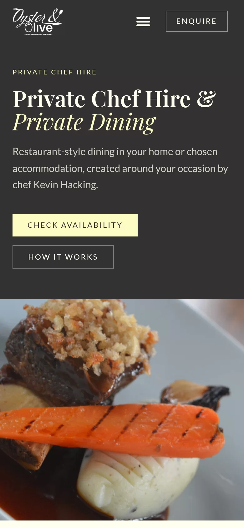
Screenshots from the finished website, showing how one design system carries across service and location pages.
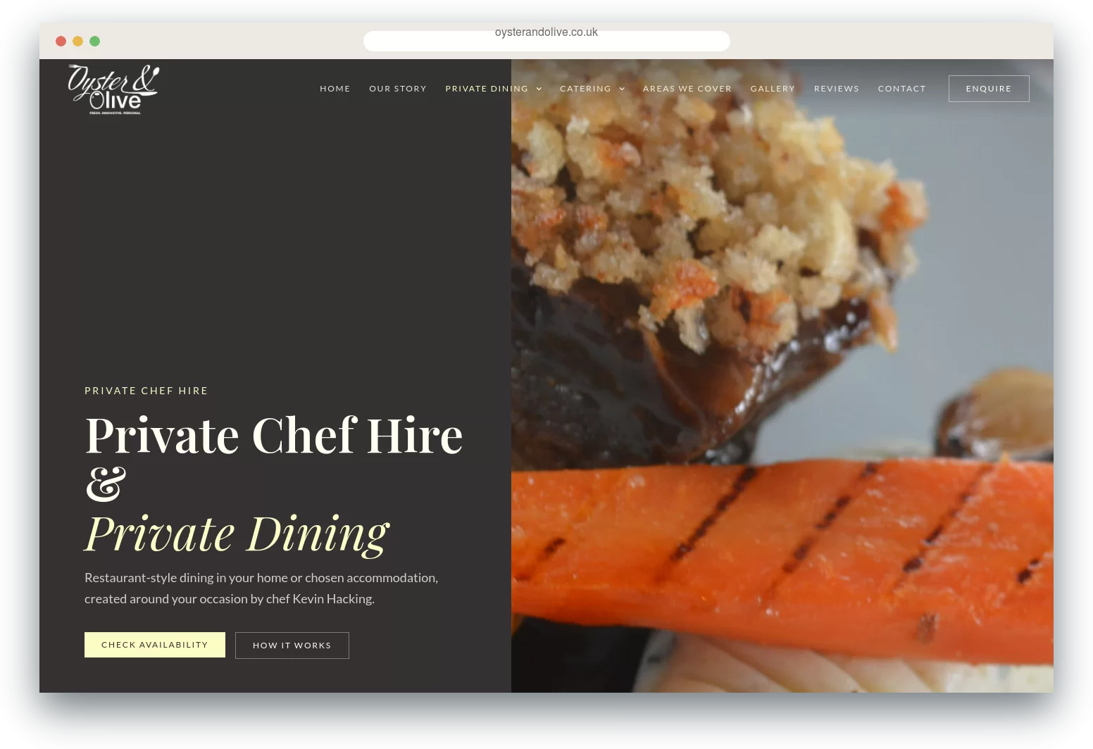
Private dining
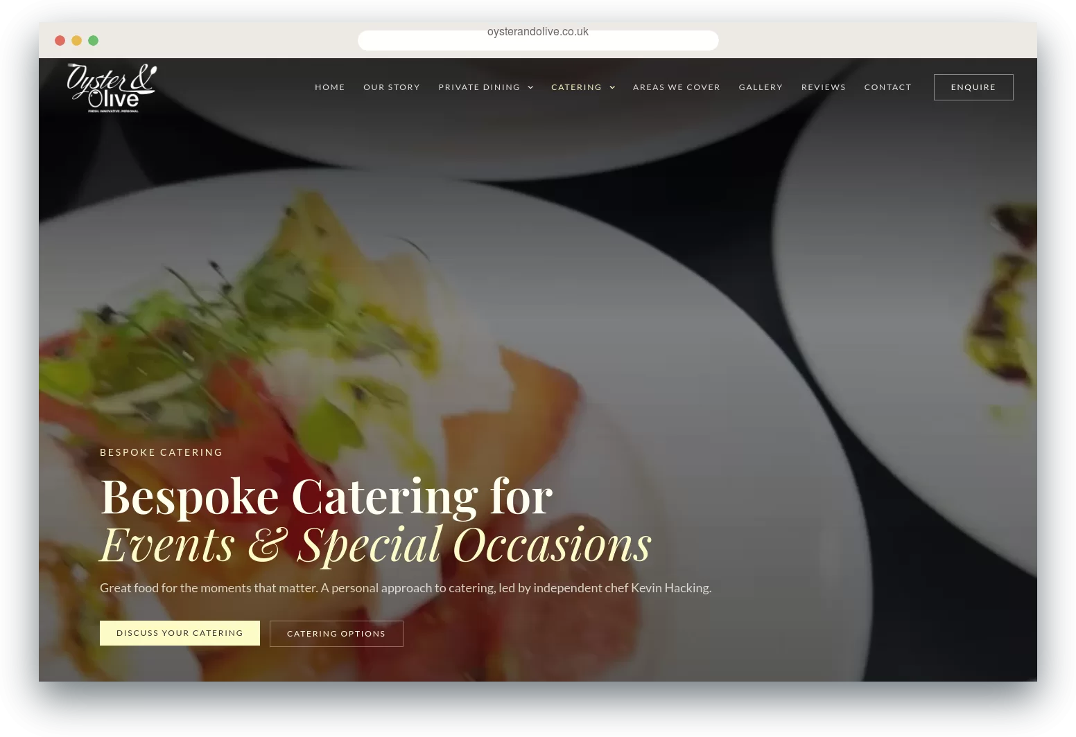
Catering
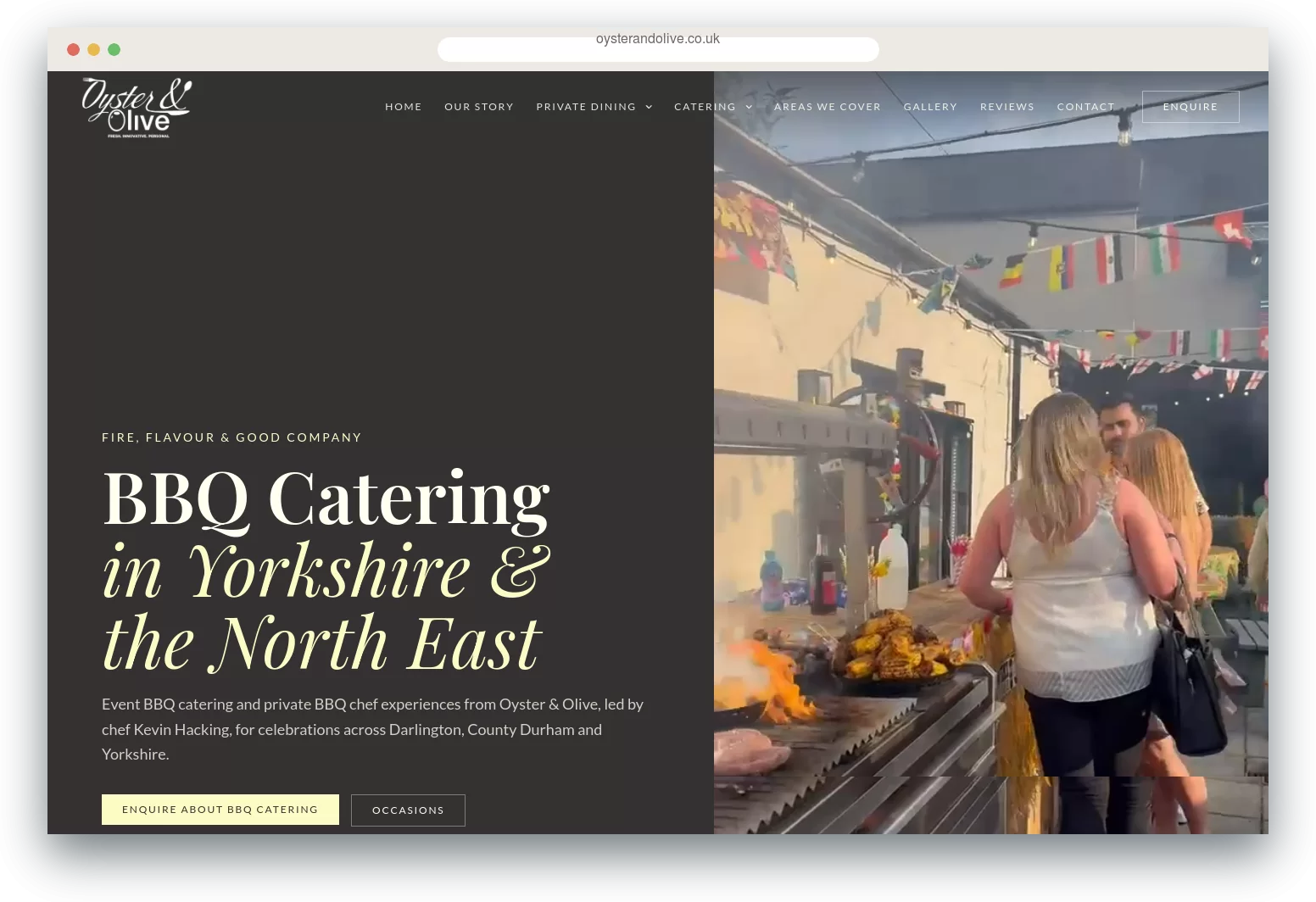
BBQ catering
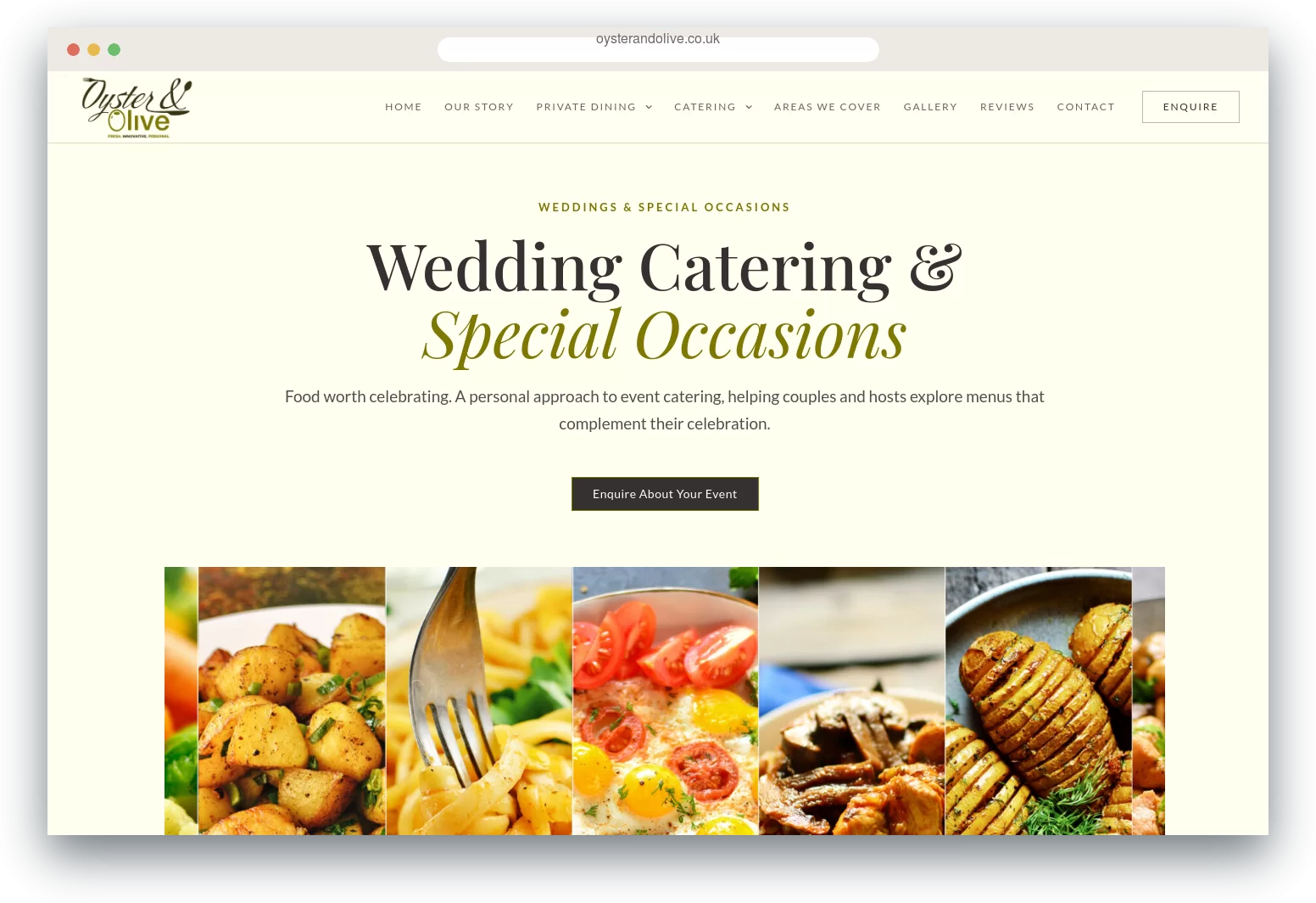
Weddings & occasions
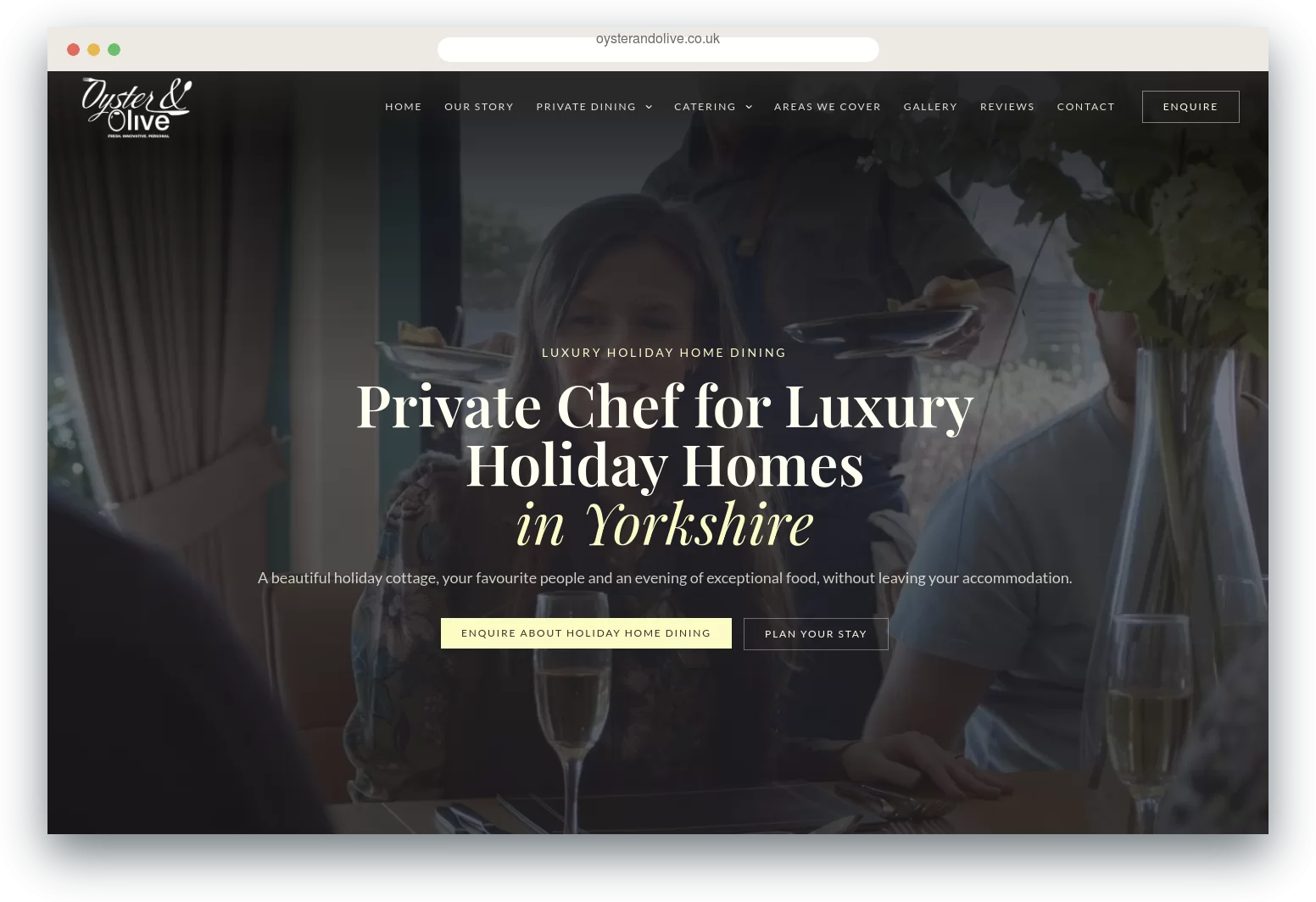
Holiday home dining
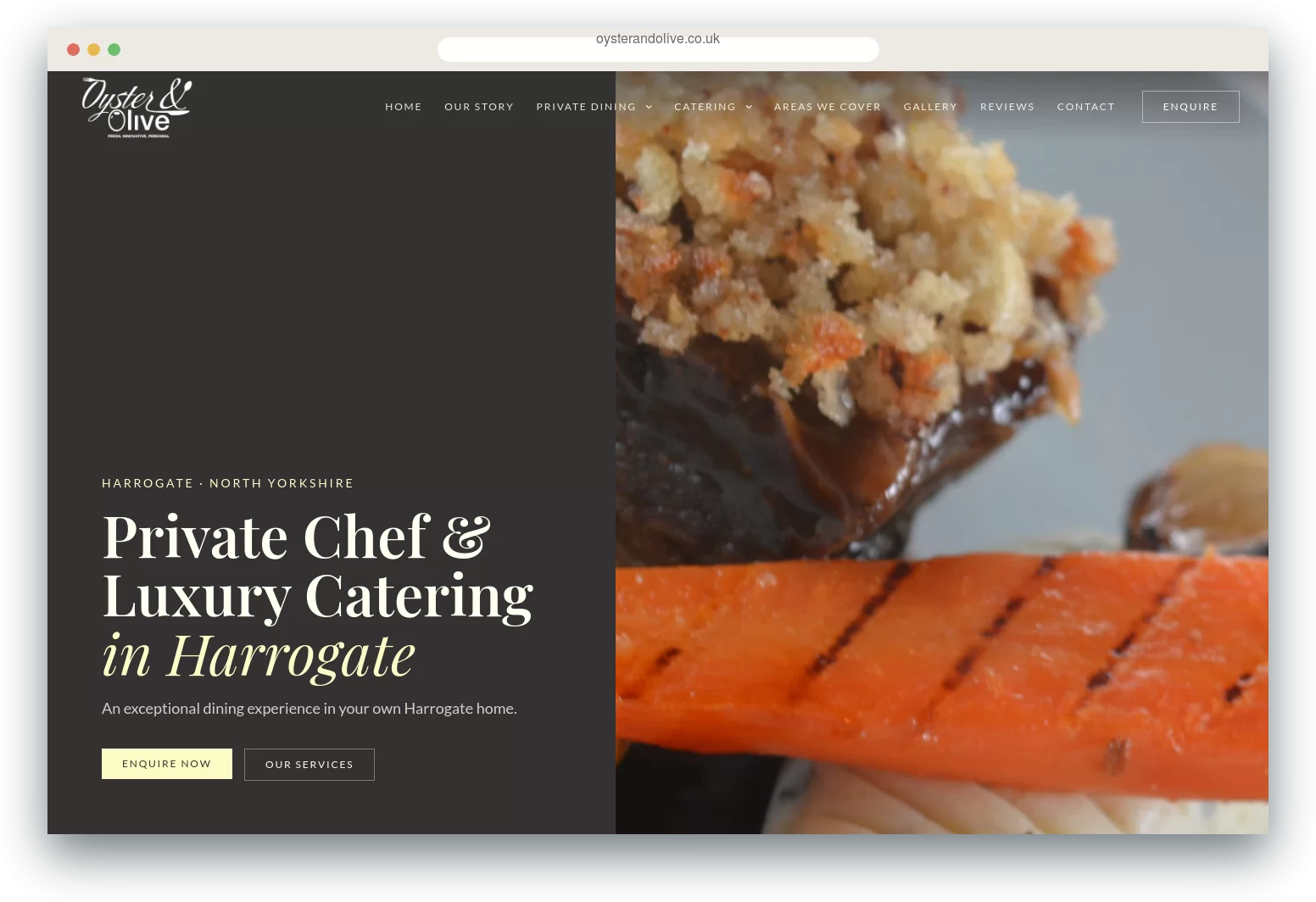
Location page
Project evolution
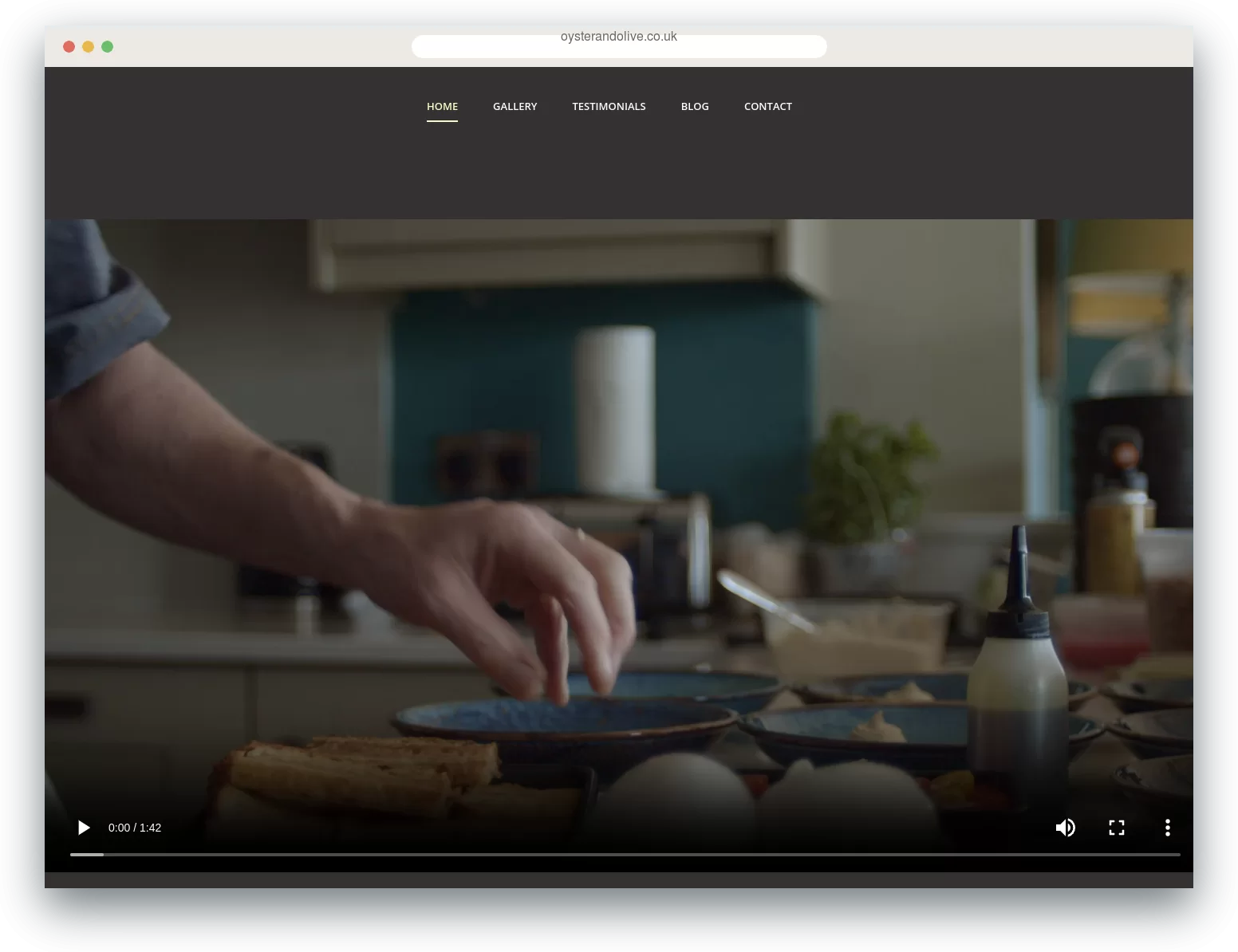
The original Oyster & Olive website was a compact site with a home page, gallery, testimonials, blog and contact page, introducing Kevin’s private dining service in the North East.
As the business grew, it needed more from its website. Kevin began working with holiday accommodation providers, added BBQ catering, and now caters for weddings, special occasions and corporate events alongside private dining. The redesigned site gives each of these services its own page, adds dedicated location pages, and presents the business with the polish its customers expect.
Working with the same client over several years means I already understand the business and the way Kevin talks to his customers. That makes it straightforward to adapt the design as requirements change, from a new service page to a complete redesign.
Before
After
The finished work
From the original logo to the latest website, Oyster & Olive shows how a consistent identity can evolve alongside a growing business.
Whether you need a logo, printed marketing or a new website, I’d love to hear about your project.

Temperley Design
Send me a message
Get in Touch
Message me and see how I can help your company get noticed.